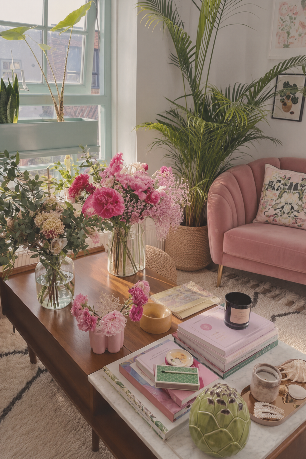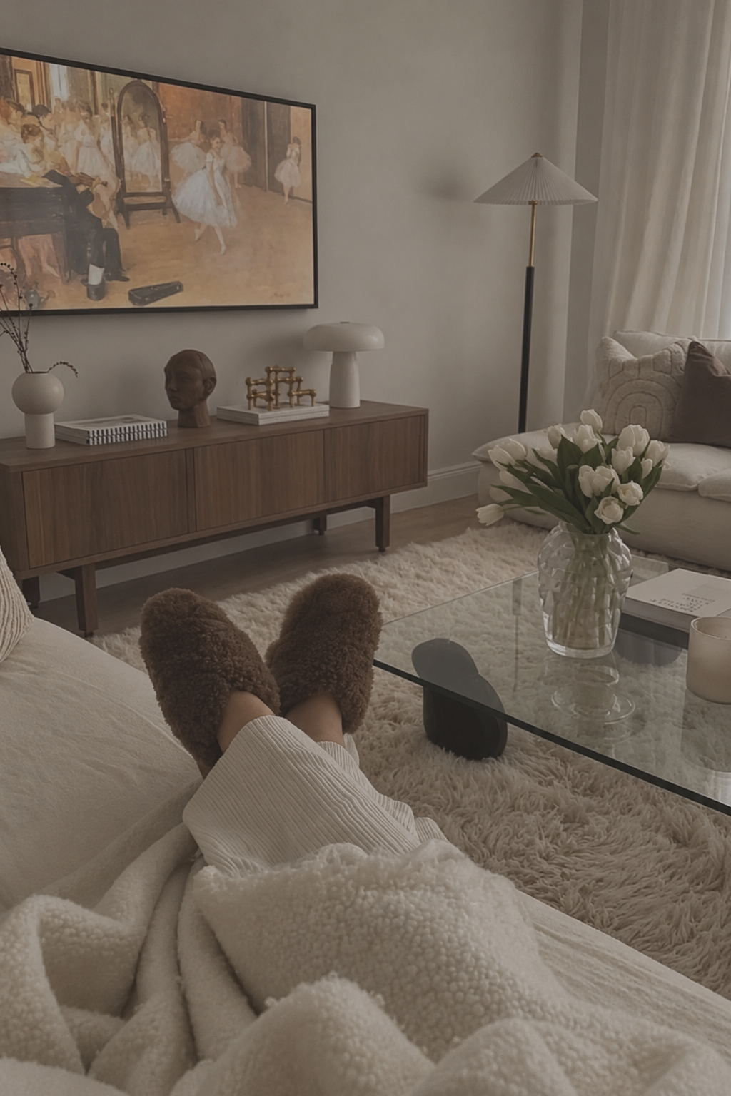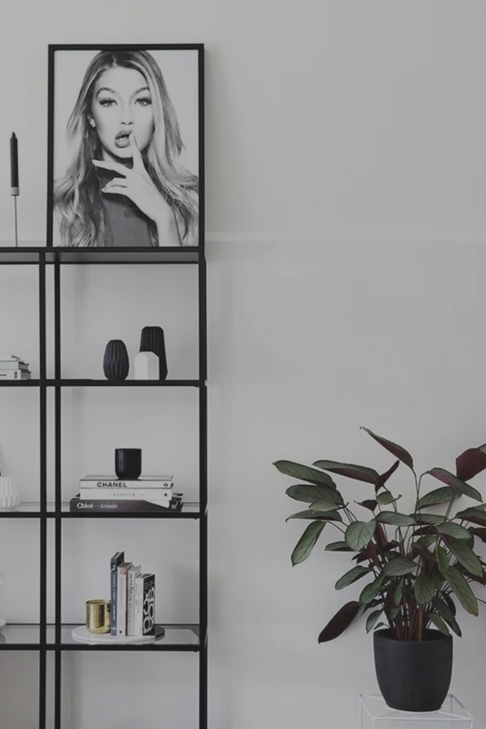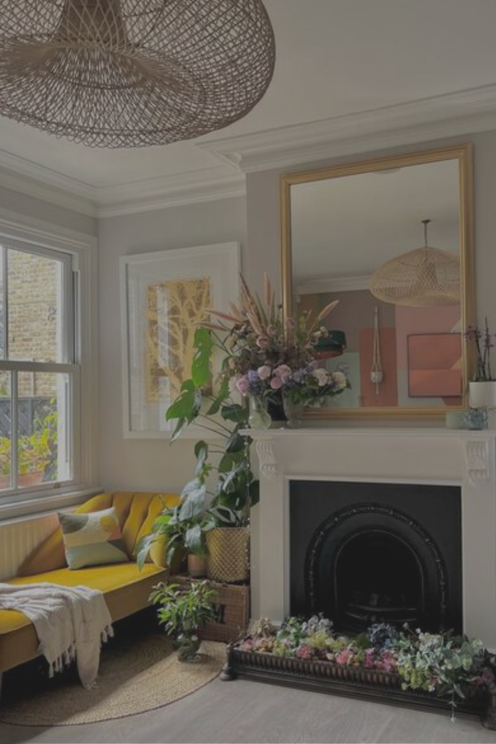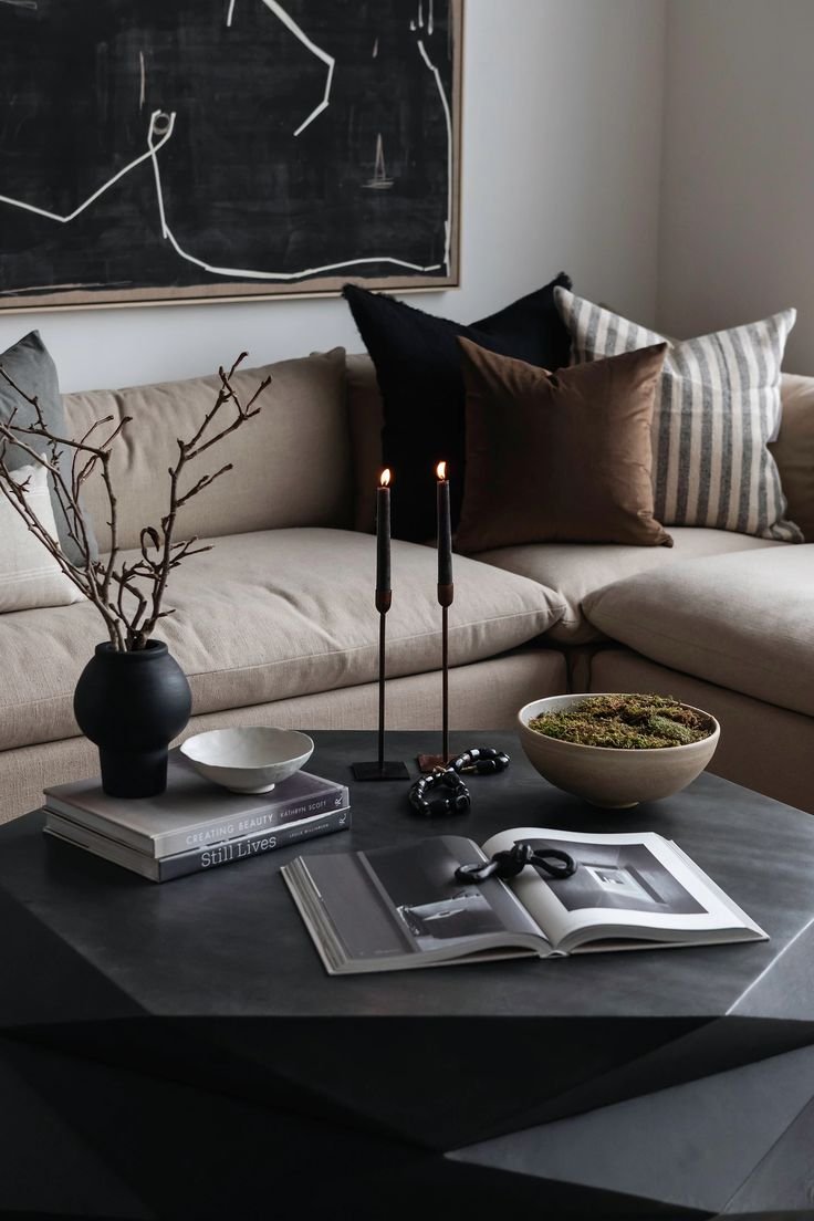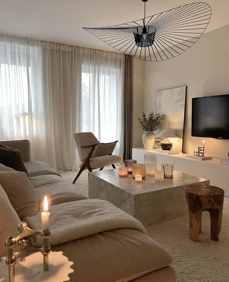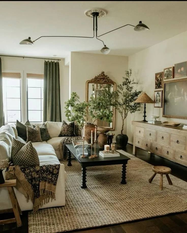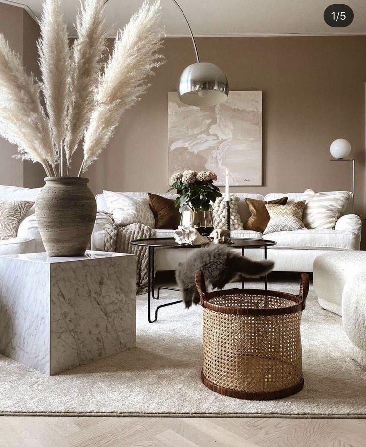
Harnessing the Healing Power of Color: How to Transform Your Home With Vibrant Energy
I still remember the first time I painted a wall a color everyone told me was "too much." My mother raised an eyebrow. A friend asked if I was sure. And then I lived in that room for a week and realized something: I felt different in there. Lighter. More like myself. That's the moment I stopped decorating for other people's comfort and started decorating for my own nervous system.
Here's what I've come to believe, and what research is increasingly backing up: your home is not just a backdrop for your life, it's an active participant in it. The colors on your walls, the hue of your sofa, the tone of the throw pillows you curl up against every night — they're quietly talking to your brain and body all day long, whether you're paying attention or not. This is the whole idea behind what I call Decor Therapy: using your space intentionally to support the way you want to feel, not just the way you want things to look on camera.
So this post is a love letter to color. It's part science, part soul. I'm going to walk you through the psychology behind seven of the most powerful hues you can bring into your living room, then hand you 25 real, doable styling ideas — with a "how to get this look" tip under each one — so you can start building a space that feels as good as it looks. Grab your favorite candle, get cozy, and let's talk color.
Why Color Matters: The Science Behind the Feeling
This isn't just an intuition thing (although I trust intuition deeply). Environmental psychologists have been studying the link between color and mood for decades, and the findings consistently point in the same direction: the colors surrounding us shape how we feel, how long we linger in a space, and even how well we rest, focus, or connect with the people in it.
A few things researchers have found:
Warm vs. cool really does register differently in the body. A study out of Pepperdine University measured participants' mood, heart rate, and cognitive performance in rooms with warm (red) versus cool (blue) backdrops, building on decades-old research from neurologist Kurt Goldstein, who first proposed that red tends to stimulate the nervous system while blue has a calming effect.
A landmark study by researchers Kaya and Epps found that specific colors reliably trigger specific emotional responses — and that the saturation and brightness of a color matter just as much as the hue itself when it comes to how uplifting or soothing it feels.
Color exposure over time shapes wellbeing, not just first impressions. A study of college students living in monochromatic residence halls found that long-term exposure to a given color influenced students' satisfaction with their space and their self-reported mood — meaning the colors you live with daily have a cumulative effect, not just a one-time "wow."
Biophilic color palettes — greens, warm browns, soft blues — are linked to lower stress, likely because they echo the natural environments our brains evolved to find safe and restorative.
In other words: this is where intuition and science shake hands. Your gut feeling that a certain shade makes you feel more you isn't just a vibe — it's backed by real, measurable psychological and physiological research. So let's break down what each hue can do for you.

The Healing Properties of Each Color
❤️ Radiant Red — Vitality, Courage & Passion
Red is bold, primal, and impossible to ignore — and that's exactly the point. Research suggests red has a genuinely stimulating effect on the nervous system, subtly elevating heart rate and alertness, which is why it's so often linked to energy, courage, and motivation. In color psychology, red is associated with confidence and passion, making it a powerful choice for spaces where you want to feel bold and alive.
Where to use it: A red accent chair, a lacquered coffee table, or even a gallery of red-toned art in the living room or home office can ignite creativity and get your energy moving — just use it with intention, since too much saturated red in a space you relax in can tip from "energizing" into "overstimulating."
💙 Tranquil Blue — Serenity, Calm & Clarity
Blue is the anti-anxiety color of the palette. It's consistently linked in research to lower perceived stress and a soothing effect on both mind and body, which is why designers reach for it again and again in bedrooms, bathrooms, and meditation corners.
Where to use it: Incorporate blue through a velvet accent chair, a tufted ottoman, or layered blue textiles to build a little pocket of calm within an otherwise vibrant room — it's the perfect color to balance out bolder, more energizing hues elsewhere in your space.
💛 Optimistic Yellow — Joy, Warmth & Mental Clarity
Yellow is liquid sunshine. It's tied to feelings of optimism and happiness, and because it reflects more light than almost any other color, it has a genuine brightening effect on darker or gloomier rooms — not just visually, but emotionally.
Where to use it: A mustard or butter-yellow throw, a sunny accent wall, or citrine-toned art near your entryway or living room can help shake off heaviness and invite in a little more lightness the moment you walk through the door.
💚 Balancing Green — Growth, Harmony & Renewal
Green is the color of biophilic design — our built-in, evolutionary response to the natural world. Because it echoes forests, plants, and open landscapes, green has a grounding, restorative effect that's been linked to lower stress and a greater sense of psychological comfort.
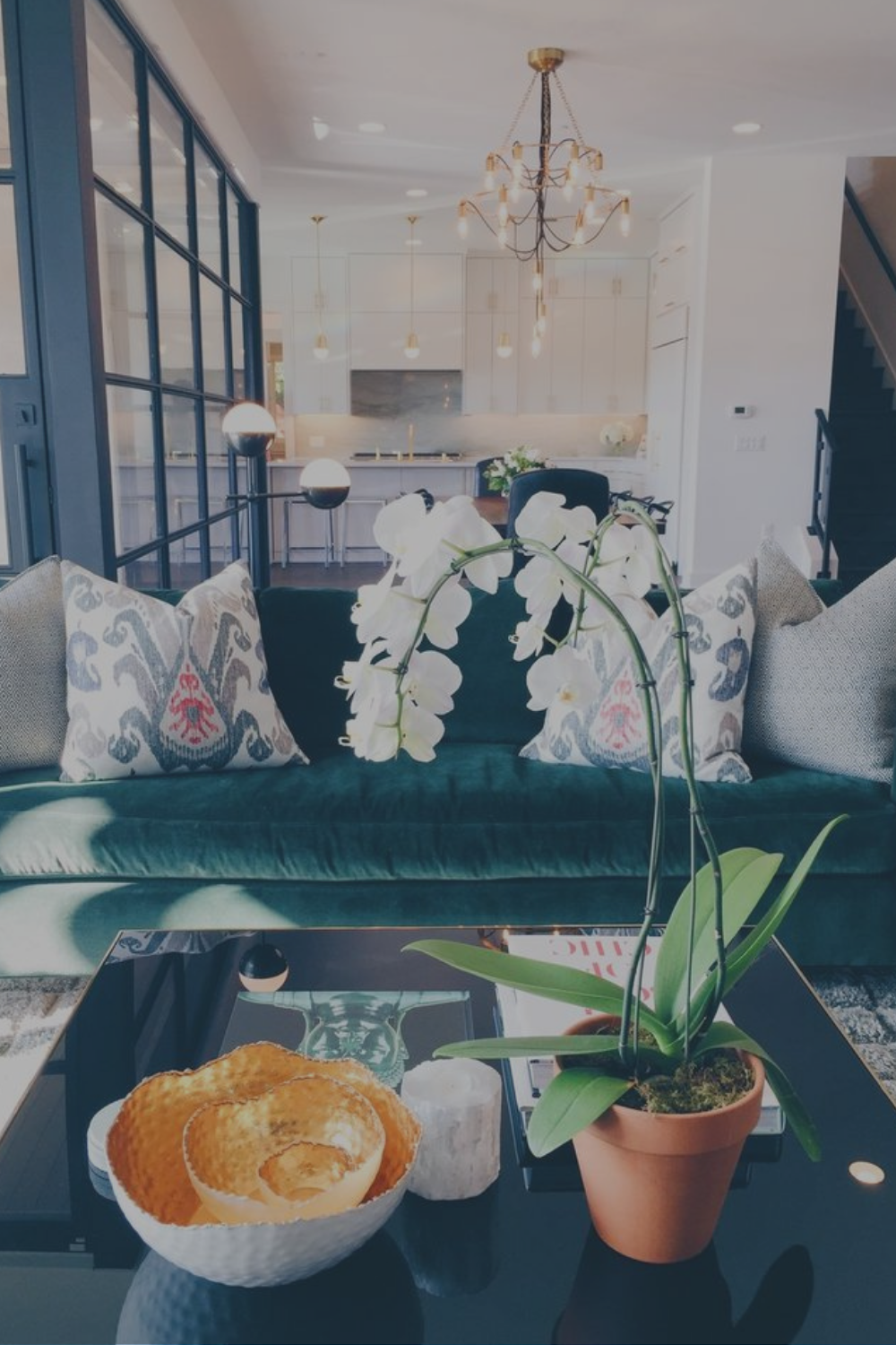
Where to use it: Oversized palms, trailing pothos, or a deep emerald velvet sofa all bring that grounding "green energy" into a living room, creating a sense of balance even in an otherwise maximalist, color-drenched space.
💜 Soothing Purple — Spirituality, Intuition & Creativity
Purple has always carried an air of mystery and depth — historically tied to royalty and ritual, and psychologically linked to introspection, creativity, and calm. It sits at an interesting crossroads: cool enough to soothe, saturated enough to feel rich and luxurious.
Where to use it: Lean into lavender or plum tones through pillows, art, or a statement chair in a reading nook or meditation corner to create a space that invites reflection rather than stimulation.
🧡 Energetic Orange — Enthusiasm, Warmth & Social Connection
Orange takes the boldness of red and the warmth of yellow and turns them into something distinctly social. Color psychology research links orange to enthusiasm, creativity, and a sense of warmth that tends to draw people together — which makes sense, since it's a color rarely seen in isolation; it wants company.
Where to use it: A burnt-orange accent chair, terracotta vases, or a citrus-toned rug in a living room or home gym can spark conversation and creative energy, especially in spaces meant for gathering.
🩷 Gentle Pink — Love, Compassion & Emotional Healing
Pink is red's softer sister — all the warmth, none of the intensity. It's consistently associated with feelings of nurturing, comfort, and emotional safety, which is exactly why it shows up so often in spaces meant for connection and rest.
Where to use it: A blush sofa, dusty rose walls, or a pink-toned gallery wall can make a living room feel instantly more romantic, soft, and healing — proof that "girly" and "grounded" aren't mutually exclusive.
25 Feminine & Vibrant Living Room Styling Ideas that will boost your mood
01 | Pair pastels with neutrals for a vibrant mood

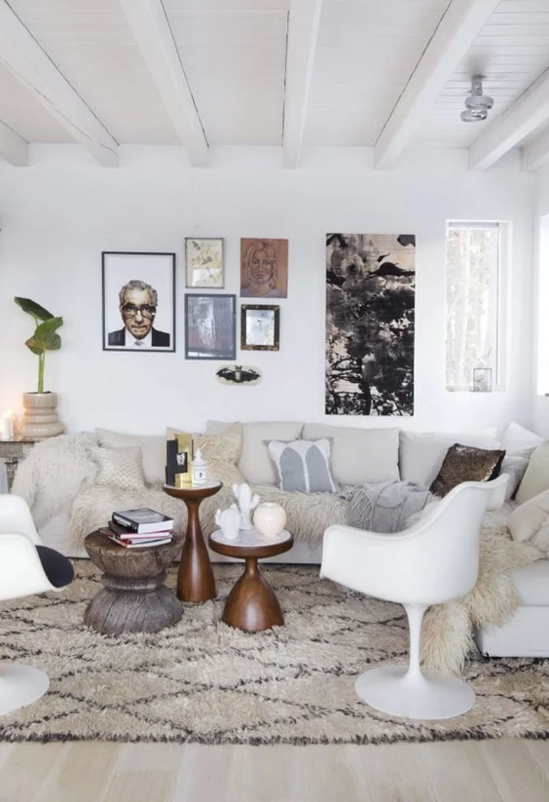
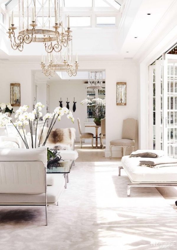
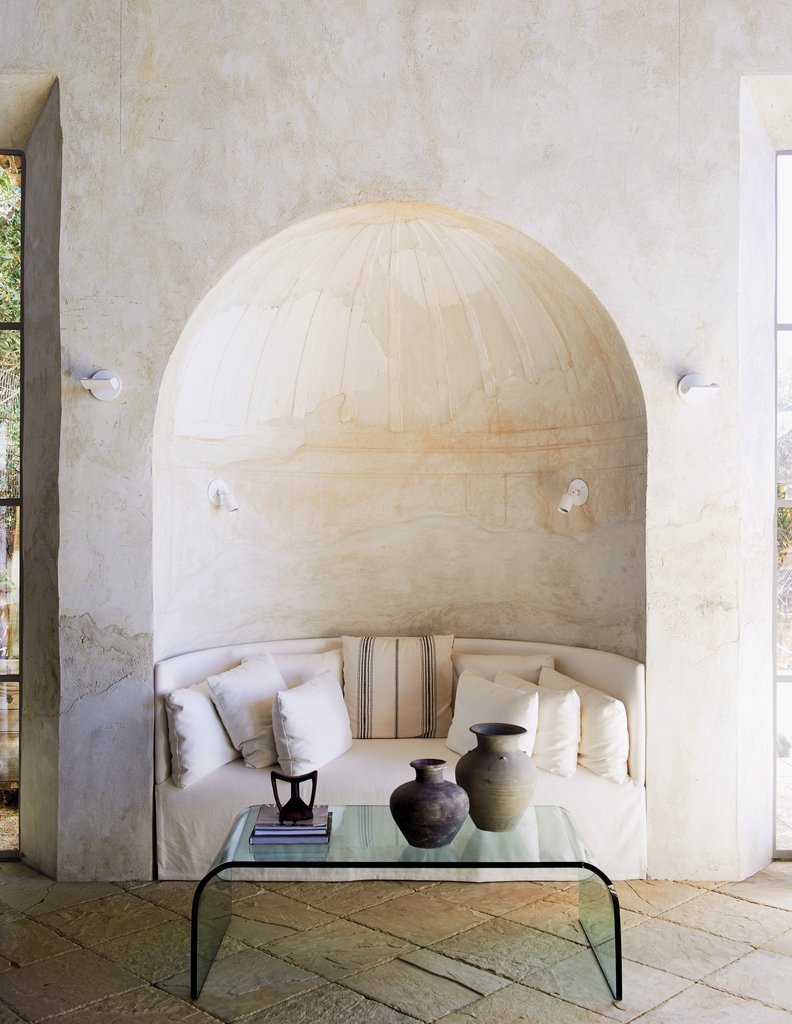
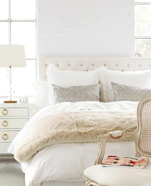
How to get this look: Start with a neutral base — think oatmeal, cream, or greige on your walls and largest furniture pieces — then layer in pastel pillows, throws, and accessories. The neutral "grounds" the pastel so it reads as elevated, not sugary.
02 | Use a bright colored sofa to enhance the uplifted energy

How to get this look: Choose one statement-color sofa (a bold pink, cobalt, or emerald) and keep the surrounding walls and floors neutral, so the sofa becomes the anchor the rest of the room is built around.
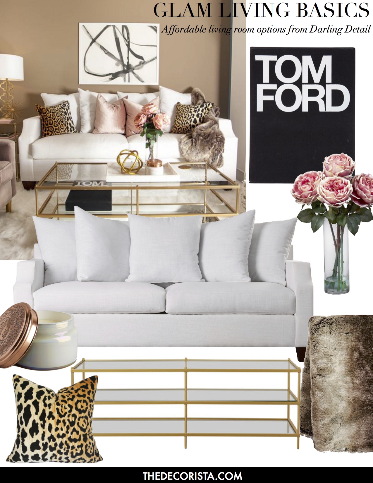
Get this look:


03 | Bring in florals to bright up the color palette
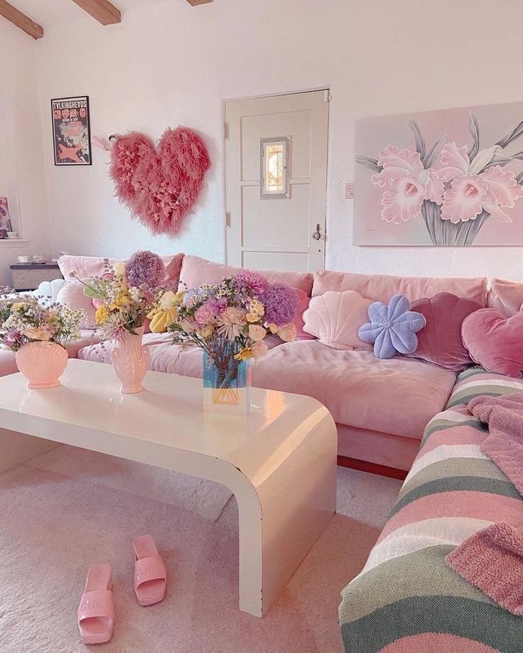
How to get this look: Fresh or dried florals in saturated hues — think peony pink, poppy red, or marigold — are the easiest, lowest-commitment way to test a color before you invest in furniture or paint.
04 | Use an art wall to bring in beautiful and vibrant color
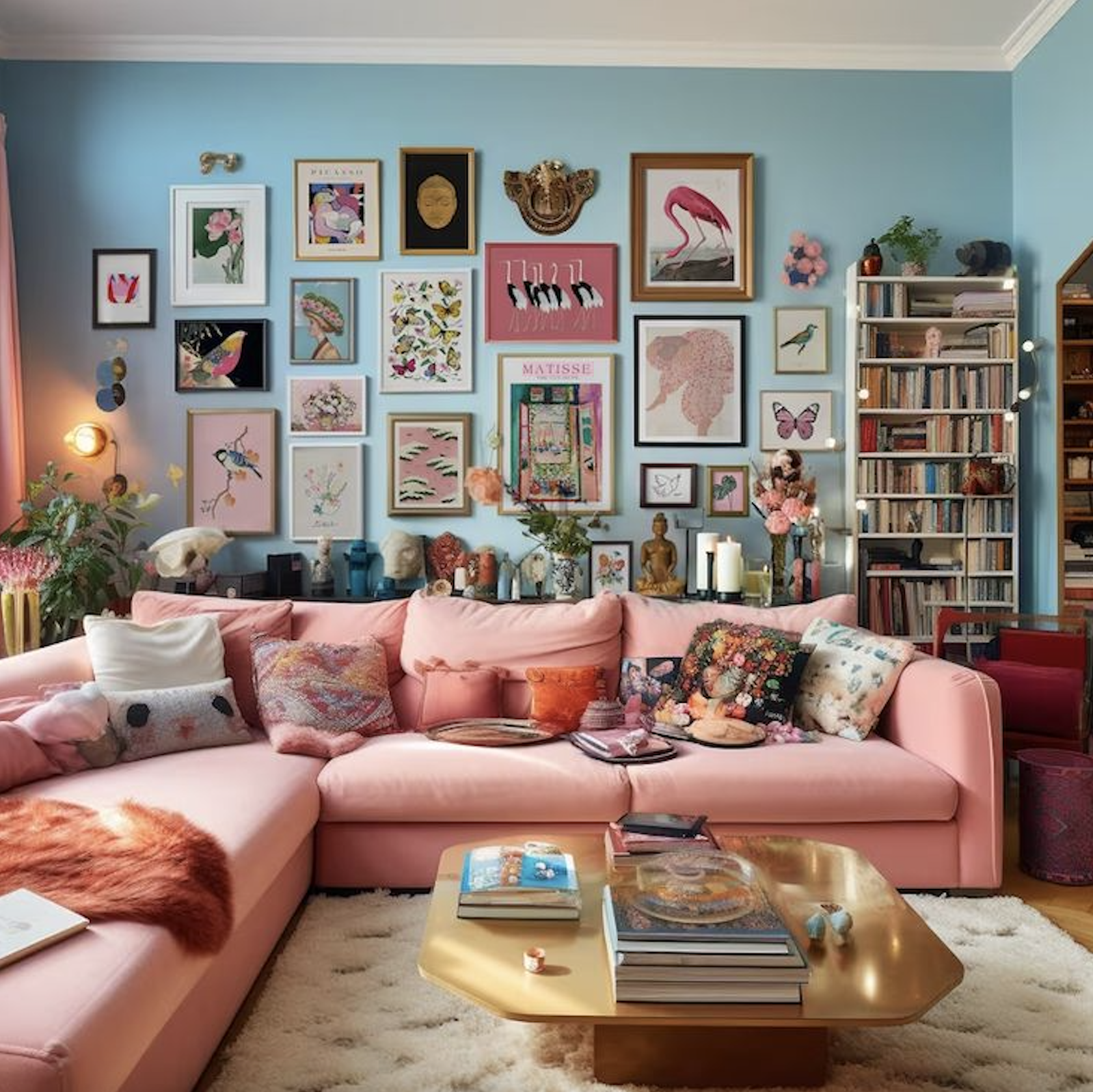
How to get this look: Choose 3–5 pieces that share a color story (even if the subjects differ) and arrange them in a loose gallery grid. A shared color palette across the art does more visual work than matching frames.
05 | Use a bold rug to create impact
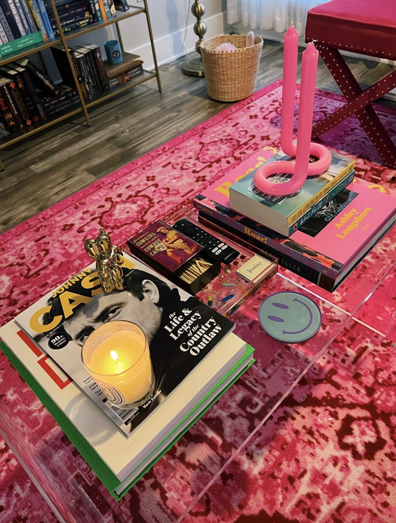
How to get this look: Let your rug do the heavy lifting — a graphic, saturated rug can anchor an otherwise neutral room, giving you color at floor level without committing to bold paint or furniture.
06 | Accent the space with hanging plants, it adds calming color

How to get this look: Mix trailing plants (pothos, string of pearls) at varying heights with structural greenery (fiddle leaf figs, palms) to bring dimensional, living color into corners that feel flat.
07 | Books can be used as the ultimate color accessory

How to get this look: Sort a stack of books by spine color and use them as sculptural accents on shelves or as a coffee table riser — instant, budget-friendly color-blocking.
Recreate this look:


08 | Use a bold wallpaper to bring in vibrant colors like pink

Kelly golightly via Traditional Home
How to get this look: If a full room feels like too big a commitment, wallpaper just one accent wall or the back of a built-in bookshelf to get the impact without overwhelming the space.
09 | Bring in pops of color through seating

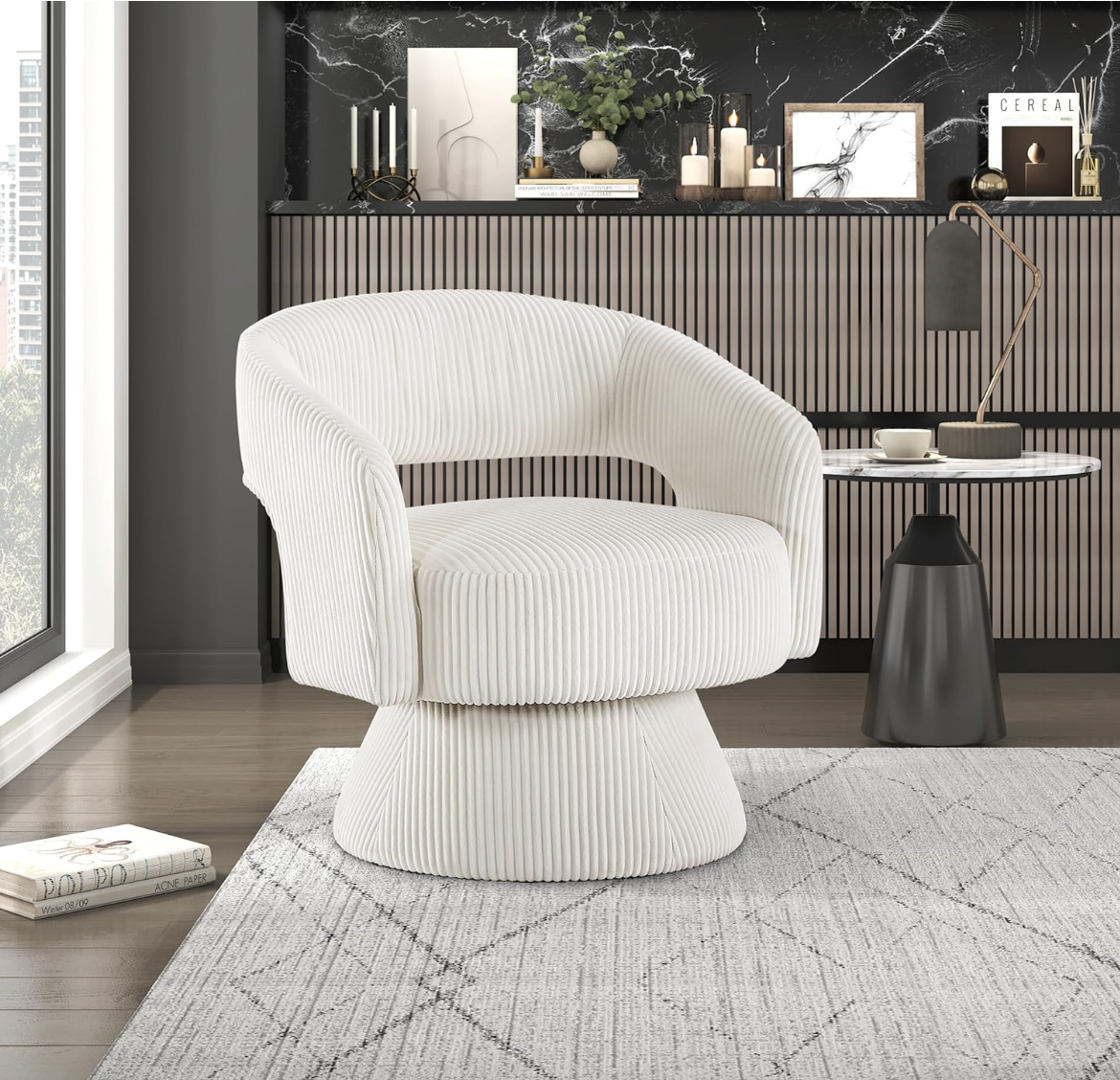
How to get this look: An accent chair in an unexpected hue (think emerald velvet or marigold boucle) lets you experiment with bold color in a way that's easy to swap out later if your taste evolves.
10 | Bring in color through unique accents like vintage doors
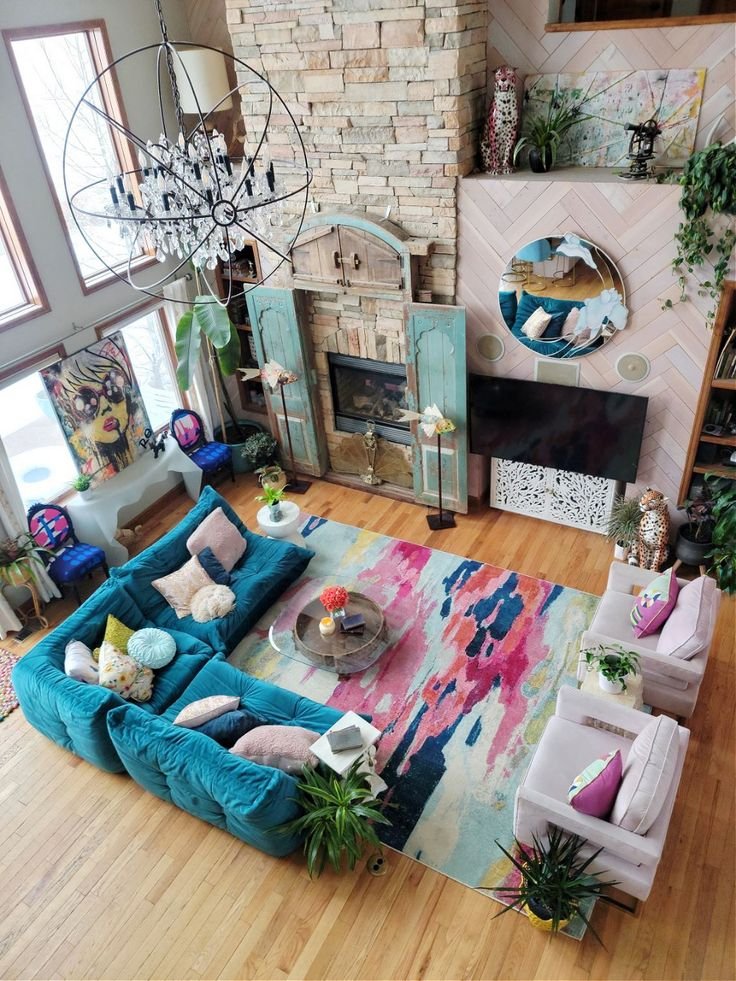
How to get this look: Scour flea markets or architectural salvage shops for painted vintage pieces — an old door, shutter, or cabinet — and use them as functional art with built-in patina and personality.
11 | Combine colors through artwork and your pillow arrangement

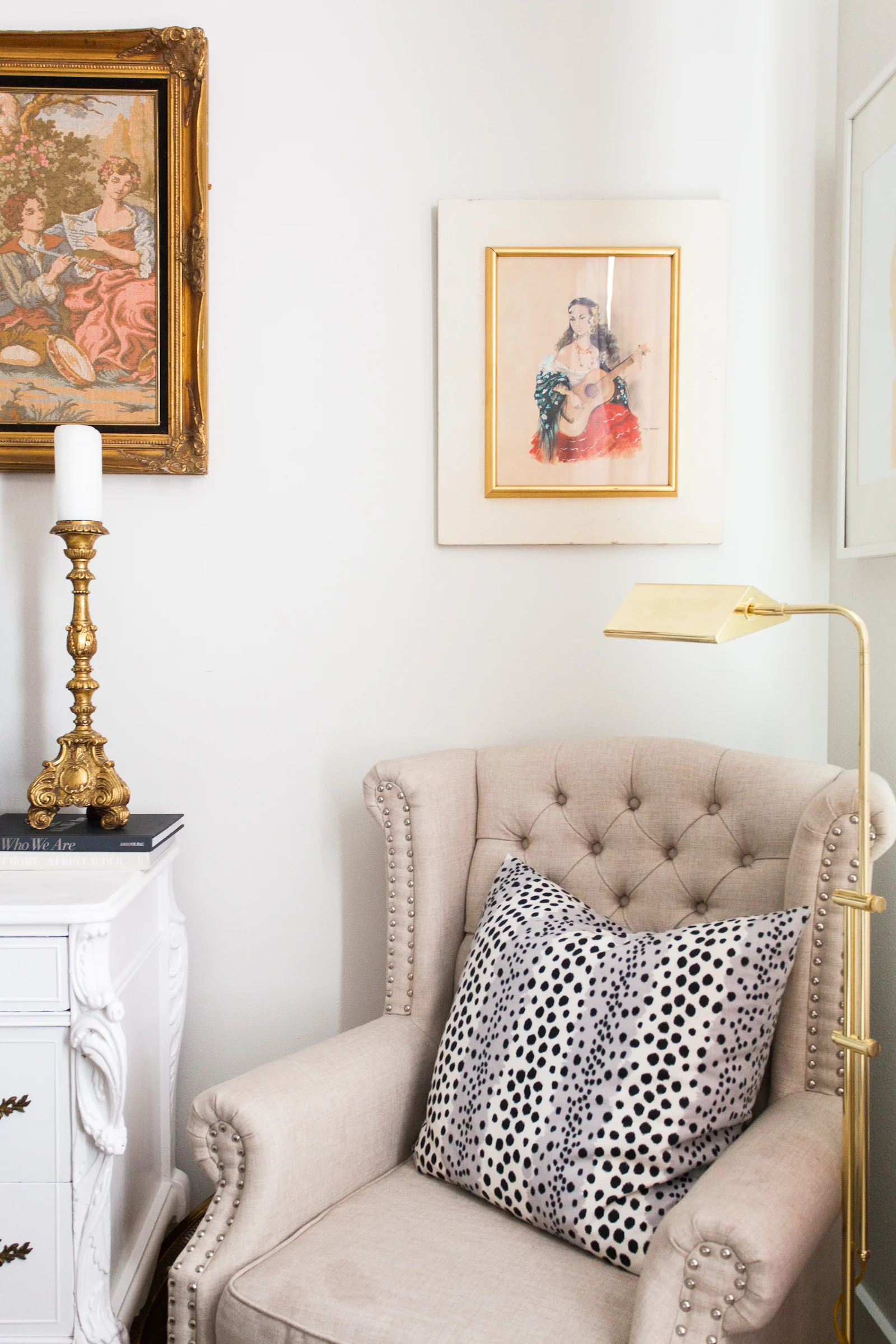
How to get this look: Pull two or three colors directly from a piece of art and echo them in your throw pillows. This "color-matching" trick makes a room feel curated rather than accidental.
12 | Add in neutral accents to balance out the color
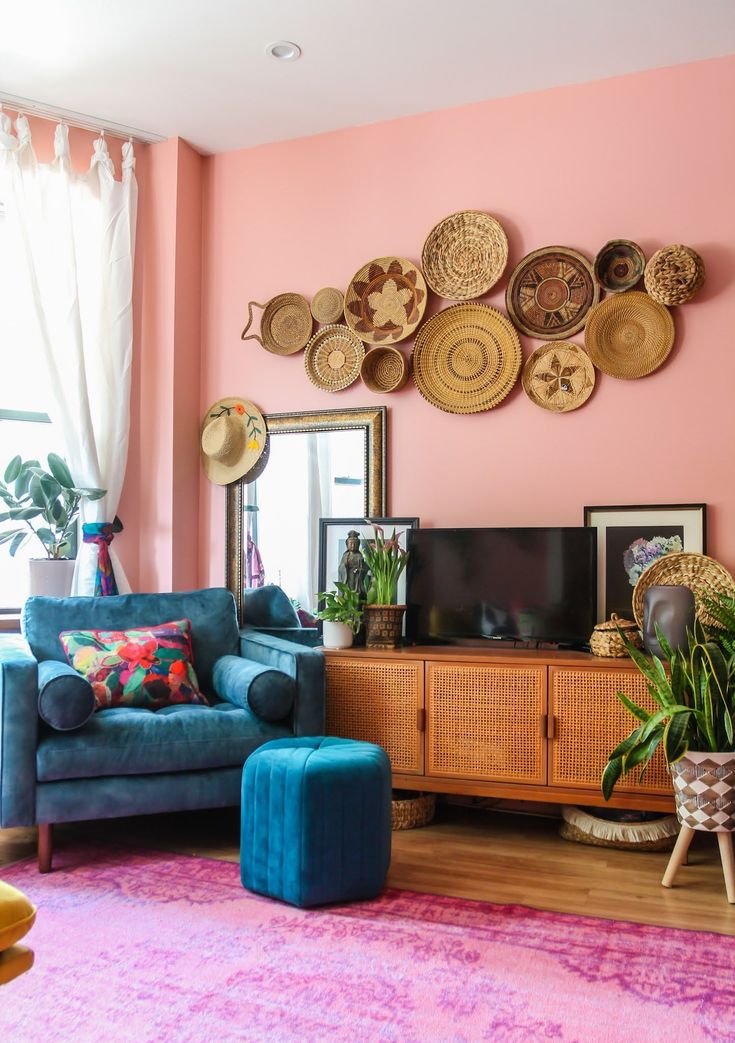
You can also throw in a bold color that is completely opposite to the wallcolor to really create a bright & happy balance. I love how this room has an electric blue velvet armchair, paired with a blue tufted ottoman to add that wow factor.
Get this look:


13 | Painted furniture can help bring a pop of color to any space

How to get this look: An old dresser, side table, or bookcase is the perfect low-risk canvas — a weekend with chalk paint can transform a thrifted piece into your room's new focal point.
14 | Mix pastels in pretty patterns and bold accents.
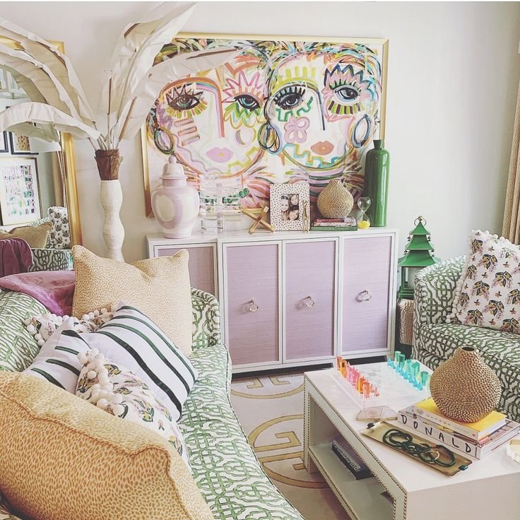
How to get this look: Anchor mixed patterns with one repeated color so they read as intentional rather than chaotic — for example, pairing a floral pillow, a striped throw, and a geometric rug that all share a common pink or coral thread.
Designer tip: I always choose the color palette of a room from the largest artwork piece. In this room, beautiful pastels mix together to create a symphony of colors. You can add in pretty patterns to pull it all together.
15 | Don’t be afraid to mix bold colors
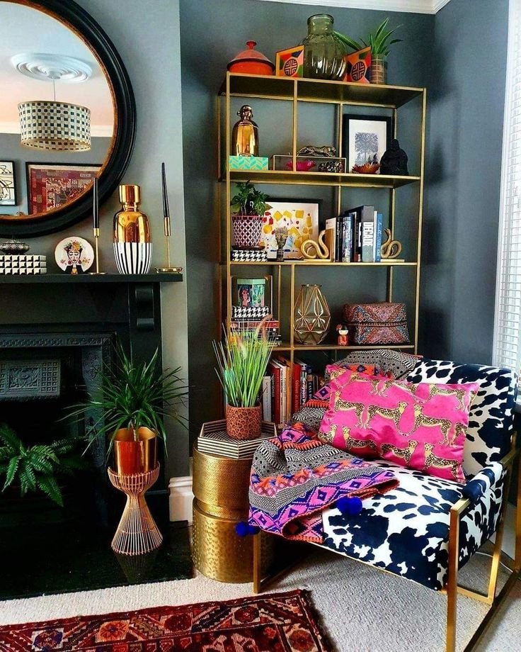
How to get this look: Use the color wheel as a guide — analogous colors (next to each other, like pink and orange) blend easily, while complementary colors (opposite each other, like blue and orange) create high-impact contrast.
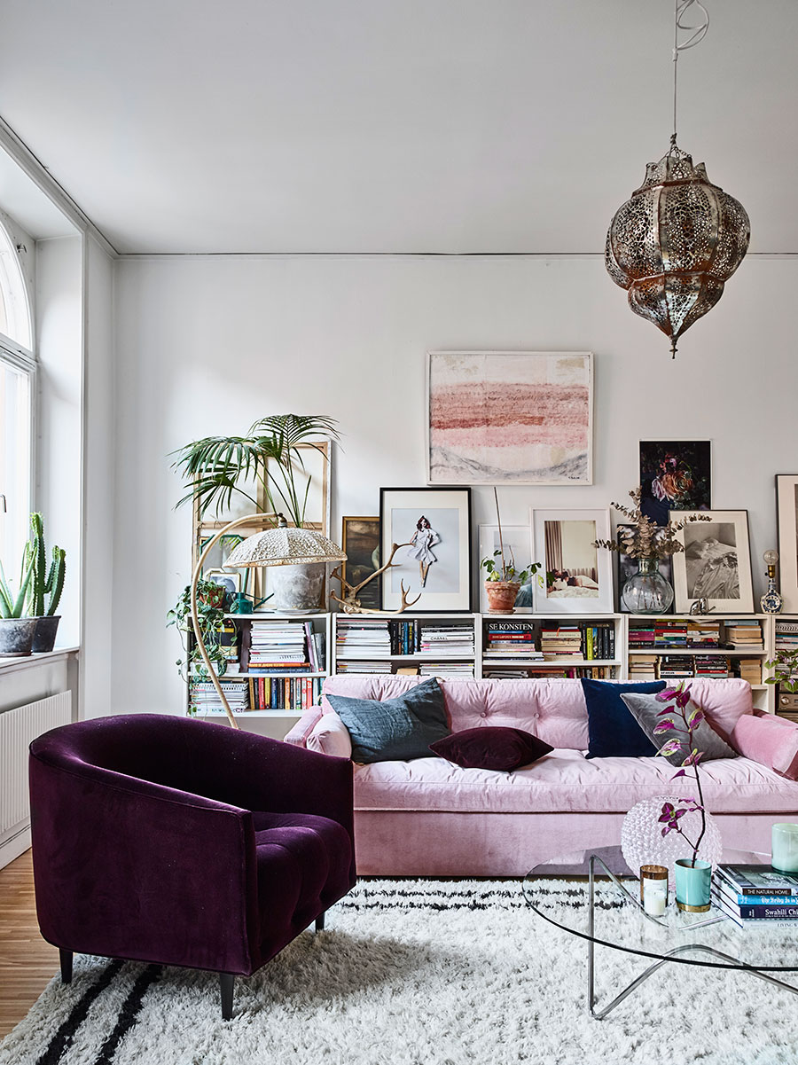
16 | A bright pink sofa can make a space feel more romantic and healing
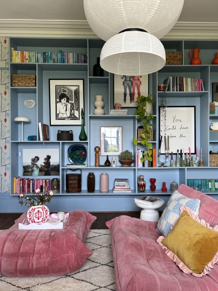
How to get this look: If a pink sofa feels like a leap, start with a slipcover or reupholster an existing piece — pink upholstery paired with warm wood tones keeps the look grounded rather than saccharine.
17 | Paint a small bookcase for a bold burst of color

How to get this look: Paint just the interior back panel of a bookcase in a saturated hue, then style the shelves with neutral objects in front — the color peeks through without taking over.
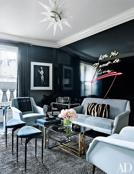
18 | A white sofa can soften up an otherwise dark colored space

How to get this look: If you've committed to a deep, moody wall color, balance it with a crisp white or ivory sofa and light wood furniture so the room still feels airy rather than cave-like.
19 | Don’t be afraid to mix patterns

How to get this look: Vary the scale of your patterns — pair a large-scale floral with a small ditsy print and a solid — so your eye has room to rest between busier moments.
20 | Oversized artwork can add to a gorgeous color palette

How to get this look: Go bigger than feels comfortable — oversized art (ideally two-thirds the width of your sofa) makes a bolder color statement than several smaller pieces ever could.
21 | Layer jewel tones to create a cozy feel

How to get this look: Combine deep emerald, sapphire, and amethyst textiles with warm brass or gold hardware — jewel tones lean cozy rather than cold when paired with metallics and soft textures like velvet.
22 | Oversized palms add healing green energy to any room
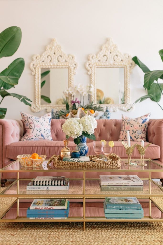
How to get this look: Choose one statement plant (a floor-height palm or fiddle leaf fig) as a living sculpture in an empty corner — it adds color, texture, and that grounding biophilic effect in one move.
23 | Use a paint color combo to cover the walls
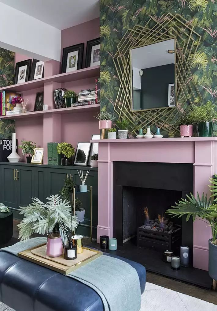
How to get this look: Try color-blocking your walls with two complementary tones divided by a chair rail or painted line — it's a bold, custom-feeling statement that costs the same as a single can of paint.
24 | Add wallpaper to the ceiling for an extra bold statement
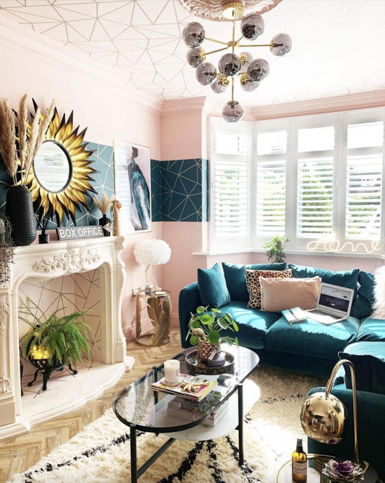
How to get this look: A "fifth wall" moment — wallpapering the ceiling in a bold print — draws the eye upward and makes even a small room feel more expansive and unexpected.
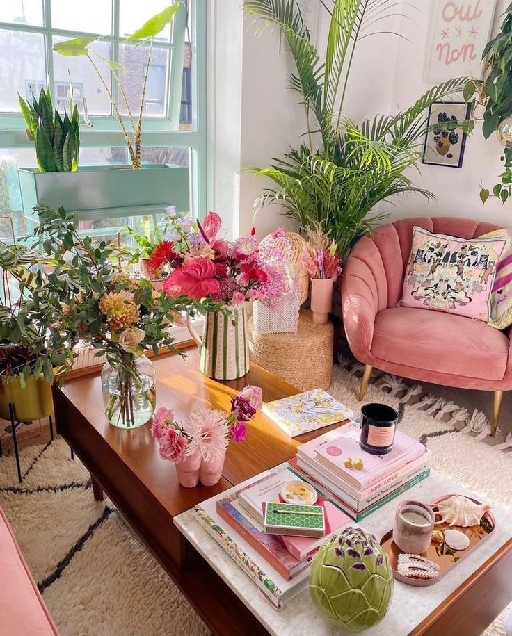
25 | Plants and florals always add rich color to any space
Frequently Asked Questions
What is color psychology in interior design? Color psychology is the study of how different hues influence human emotion, mood, and behavior. In interior design, it's used intentionally to shape how a room feels — for example, using calming blues in a bedroom or energizing reds in a creative space.
What are the best colors for a living room to boost mood? Warm, saturated tones like coral, marigold, and terracotta tend to boost energy and social connection, while soft pinks, sage greens, and dusty blues create a calmer, more nurturing feel. Most vibrant living rooms actually mix both — a warm anchor color balanced by a few cooler, grounding tones.
Can bold or bright colors really affect your mood? Yes. Research in environmental psychology has repeatedly linked color exposure to measurable changes in mood, stress levels, and even physiological markers like heart rate. The saturation and brightness of a color matter as much as the hue itself.
How do I add color to my living room without it feeling overwhelming? Start small — pillows, throws, art, or a single accent chair — before committing to paint or large furniture. Anchoring bold colors with plenty of neutral space (walls, flooring, larger furniture) keeps a vibrant room feeling curated rather than chaotic.
What color should I avoid in a room I relax in? Highly saturated, stimulating colors like true red or neon orange used across large surfaces (like all four walls) can feel overstimulating in a space meant for rest. These colors work best as accents rather than dominant tones in relaxation-focused rooms.
Is pink a good color for a living room? Yes — pink is associated with warmth, comfort, and emotional healing, making it a surprisingly versatile living room color. Dustier, muted pinks read as sophisticated and grounded, while brighter pinks add romance and playfulness.
How can I use color psychology to make my home feel like a sanctuary? Choose colors based on how you want each room to make you feel, not just what's trending. Cooler, more muted tones (blues, greens, soft lavenders) tend to support rest and calm, while an intentional pop of a warmer hue can bring in energy without overwhelming the space.
Do I need to hire a designer to use color psychology at home? Not at all. Start with your own intuition — notice which colors you're consistently drawn to — then use small, low-commitment changes (pillows, art, a painted accent piece) to test how a color actually feels in your space before making a bigger investment.
Share Your Colorful Transformation 🌈
I would love nothing more than to see how you're bringing color and healing energy into your own home. Did one of these hues speak to you? Are you drawn to the calm of tranquil blue, or does gentle pink feel like your soul color right now?
Drop a comment below and tell me: which color are you most drawn to, and why? Or tag me on Instagram with photos of your own colorful living room transformation — I'll be resharing my favorites to stories. Let's build a little community of women who believe your home should feel as good as it looks.
This post may contain affiliate links. That means that if you click on a link and purchase something I recommend, I will receive a small commission at no extra cost to you. As an Amazon Associate, I earn from qualifying purchases. This helps keep my website up and running and is very appreciated. Thank you for your support!
you may also like:
💚 17 glamorous ways to decorate with green
💚 How to cultivate a home that calms your nervous system
💚 How to get the Palm Beach aesthetic in your home
💚 How to decorate the wall above your sofa
Please feel free to email me at ashlina@thedecorista.com if you have any questions! I’m always happy to help with decorating, life advice or even picking out a specific perfume! Have an amazing day!!
Also, check out my Amazon shop HERE to shop all my favorite things, tips and tricks. You can also download the free LIKETOKNOW.IT app and follow me HERE.
STAY IN THE KNOW: Don’t forget to sign up for my exclusive Love Letters for STYLE TIPS, LIFE ADVICE, COSMIC TEA, AND MUCH MORE!
As always, thank you so much for stopping by today, I truly appreciate all of you! xo, Ashlina
FOLLOW ALONG: Instagram | Pinterest | Shop Amazon | You Tube