Have you ever scrolled through Pinterest or flipped through a design magazine and noticed a completely neutral room—then suddenly, there it is: a red chair. A red bowl. A single red lampshade that somehow makes the room. That’s the magic of the “unexpected pop of red” theory—a long-standing design principle rooted in art history that’s been quietly making spaces sing for centuries.
Let’s break down the history, the color theory behind it, and how you can easily bring this fiery, fabulous pop into your own home—no matter your style.
What Is the “Unexpected Pop of Red” Theory?
At its core, this theory is simple: even in the most muted, neutral, or monochrome spaces, a single (or subtle) touch of red can instantly create visual interest and emotional impact. The red element becomes a focal point, adding warmth, life, and just the right amount of drama.
Designers and artists have long understood this principle, which is rooted in how the eye reacts to the color red. Even a small amount draws attention immediately—our brains are wired to notice it. That’s why it’s often used sparingly: a little goes a long way.
A Quick History: Red in Art and Design
The use of red as a visual anchor dates back centuries. In Renaissance paintings, artists would strategically use red—often in a cloak, flower, or background element—to draw the viewer’s eye to the central subject. Painters like Caravaggio and Titian would often use deep crimson or cardinal red to highlight emotion and movement within their compositions.
In the modern design world, red became iconic in mid-century interiors, often through red chairs, telephones, or even kitchen appliances—used to add personality to otherwise functional spaces.
Even today, famed designers like Axel Vervoordt or Jean-Louis Deniot will sneak in a singular red book or textile to break up a sea of beige and create intrigue.
The Color Theory Behind Why Red Works
Red sits on the warm side of the color wheel and is considered one of the most emotionally intense colors. It symbolizes passion, vitality, strength, and alertness.
From a psychological standpoint:
Red stimulates the senses—which is why it’s often used in restaurants and kitchens.
It adds energy to spaces that might otherwise feel flat or overly calm.
It creates contrast against cool neutrals like gray, beige, cream, and white.
The key is balance—when used intentionally and sparingly, red becomes a visual punctuation mark.
This principle shows up in fashion, too. Think of an all-black outfit suddenly paired with a red handbag or bold red lip—it instantly becomes editorial. Even red nails can send a confident, magnetic message. If you’re curious about how red polish plays into attraction and feminine energy, don’t miss this blog post on the Red Nail Theory.


Best Shades of Red to Use
Not all reds are created equal. The shade you choose can completely shift the tone of your space:
Carmine / Crimson: Deep, moody reds that add elegance (great for traditional or dramatic rooms).
Tomato / Cherry Red: Classic and bold—perfect for kitchens or mid-century spaces.
Brick / Terra Cotta: Earthy reds with orange or brown undertones—ideal for boho, rustic, or Mediterranean styles.
Poppy / Scarlet: Bright and fresh—adds a playful pop in modern or minimalist spaces.
Burgundy / Wine: Sophisticated and rich—perfect for cozy nooks or moody libraries.

Shop unexpected pops of red here:
Cherry toilet bowl cleaner | red toile pillow | red strawberry vase | red heart glasses | red taper candles | red cake stand | red flower art | red cherry art | red soap container | red garden stool

Unexpected Pops of Red in the Home: Ideas & Examples
Here are some ways to bring in that red moment without overwhelming your space:
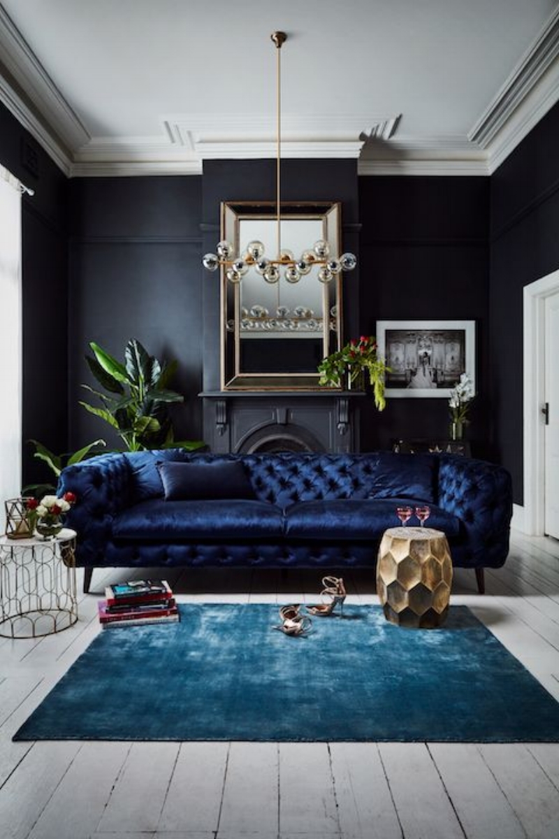
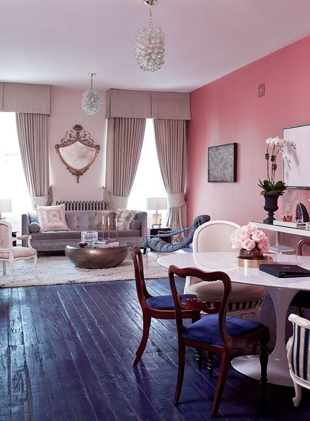
1. One Bold Accent Chair (or sofa)
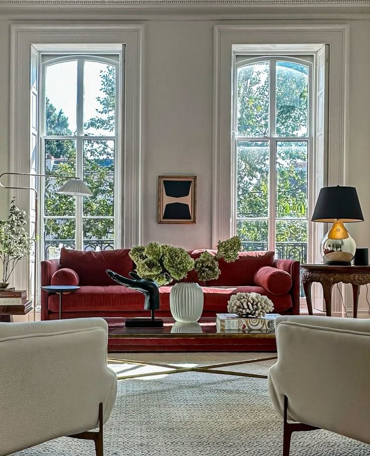

photo credit: Haris Kenjar
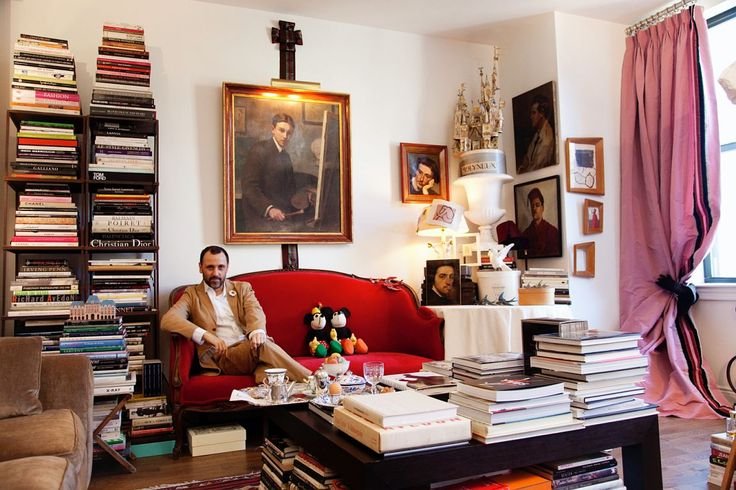
Herve Pierre via Todd Selby
Imagine a creamy, linen living room—and then one cherry red vintage armchair in the corner. Instant art.
2. Red Book SHELF or STORAGE PIECE


credit: pinterest . com
Subtle but effective. Even a single red book can give your shelf styling that "designer touch."
3. Red Art Frame or MATTE


If you're doing a gallery wall, a single red frame amidst black and wood tones can bring balance and surprise.
4. KitchenAid Mixer or Coffee Maker

Credit: @itamitu
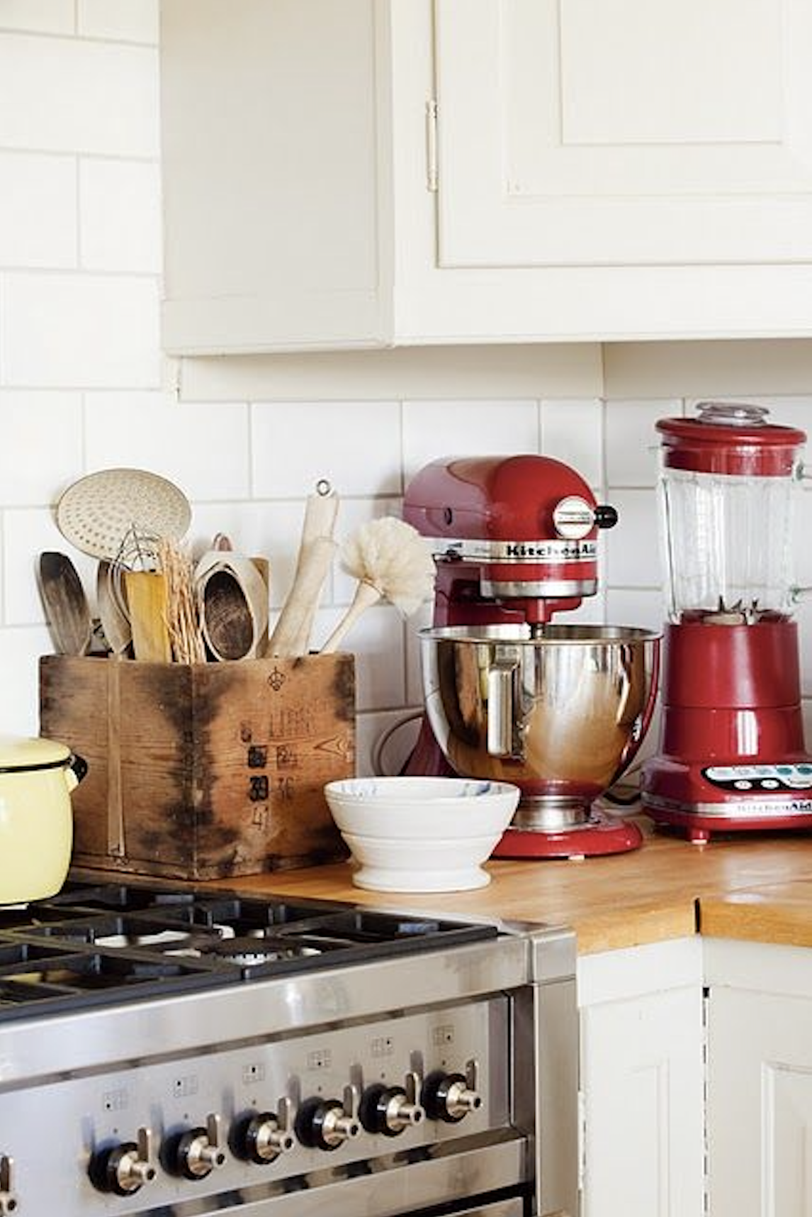
Functional and fabulous. A classic red appliance becomes the jewel of your countertop.
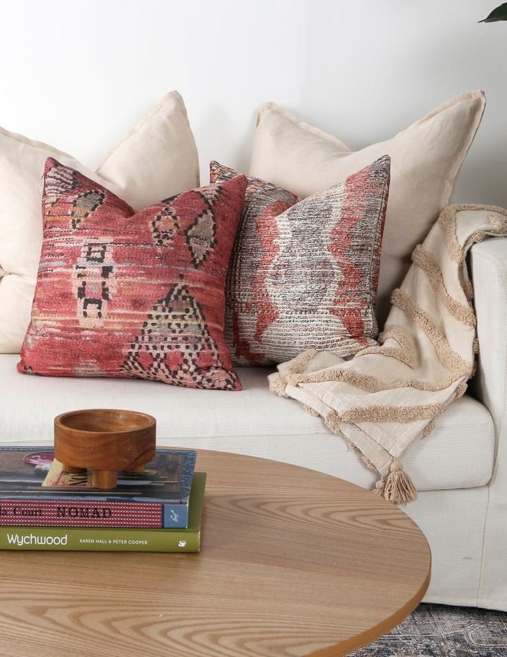
5. Red Throw Pillow or Blanket
Especially powerful in a neutral bedroom or minimalist sofa setup. Just one can shift the whole energy.
6. Front Door or Entryway CONSOLE

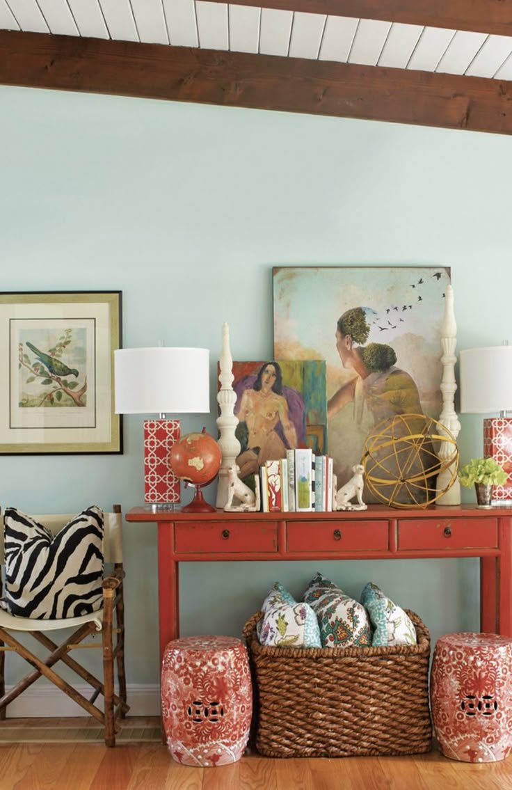
For the more adventurous, a red door (think fire-engine or oxblood) on an otherwise neutral home exterior is iconic.
7. Red Lampshade or Light Fixture
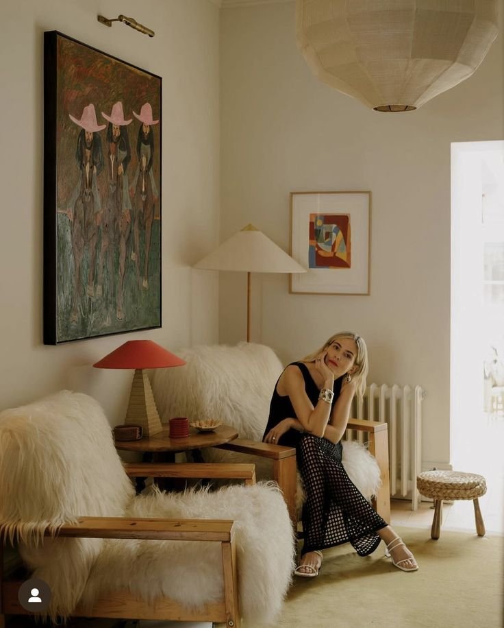

Creates mood and warmth—especially when lit at night. It makes the whole room feel cozier.
8. MUTED Red Art

credit: pinterest . com
9. Red Curtains or ACCENT fabrics

Credit: DeVol Kitchens
10. Red MIRROR

credit: studio Duggan
An unexpected red mirror in a small powder room really makes a glamorous statement.
11. Red STATEMENT PIECE

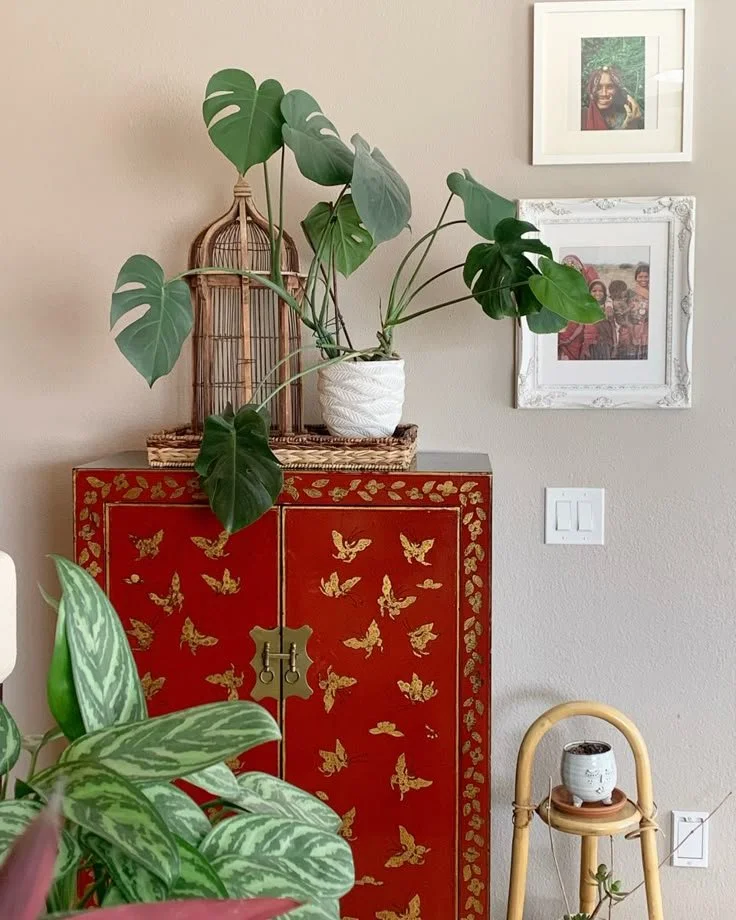
Credit: pinterest . com
An inspired chinoiserie lamp or cabinet is indicative of the “lucky” or “auspicious” color in the East. The color red brings in luck, you’ll see many Chinoiserie statement pieces in red.
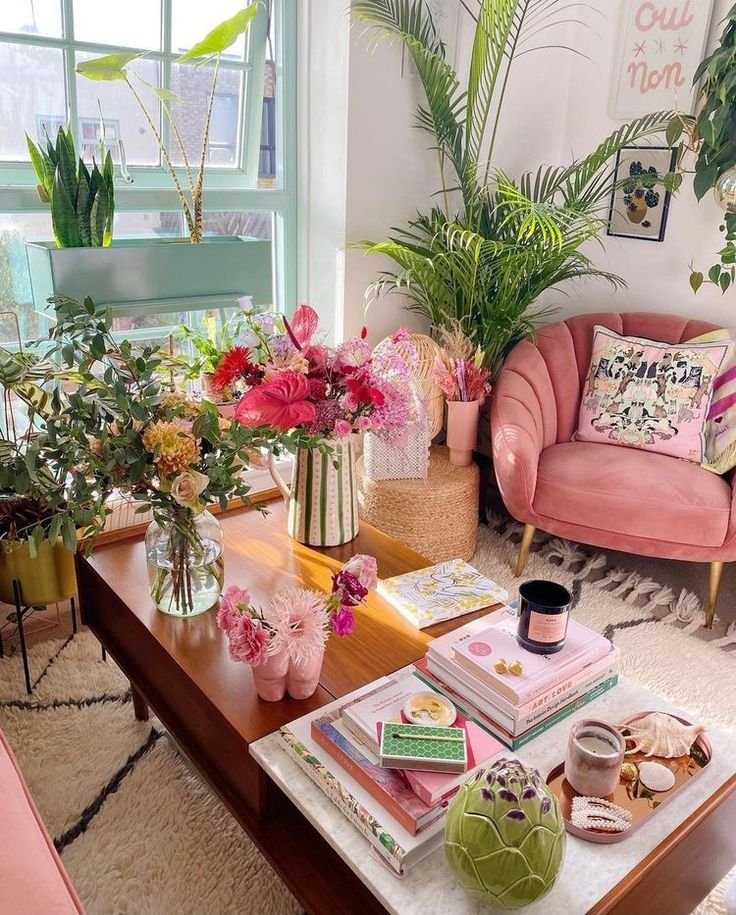
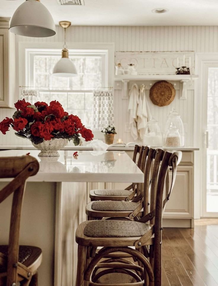
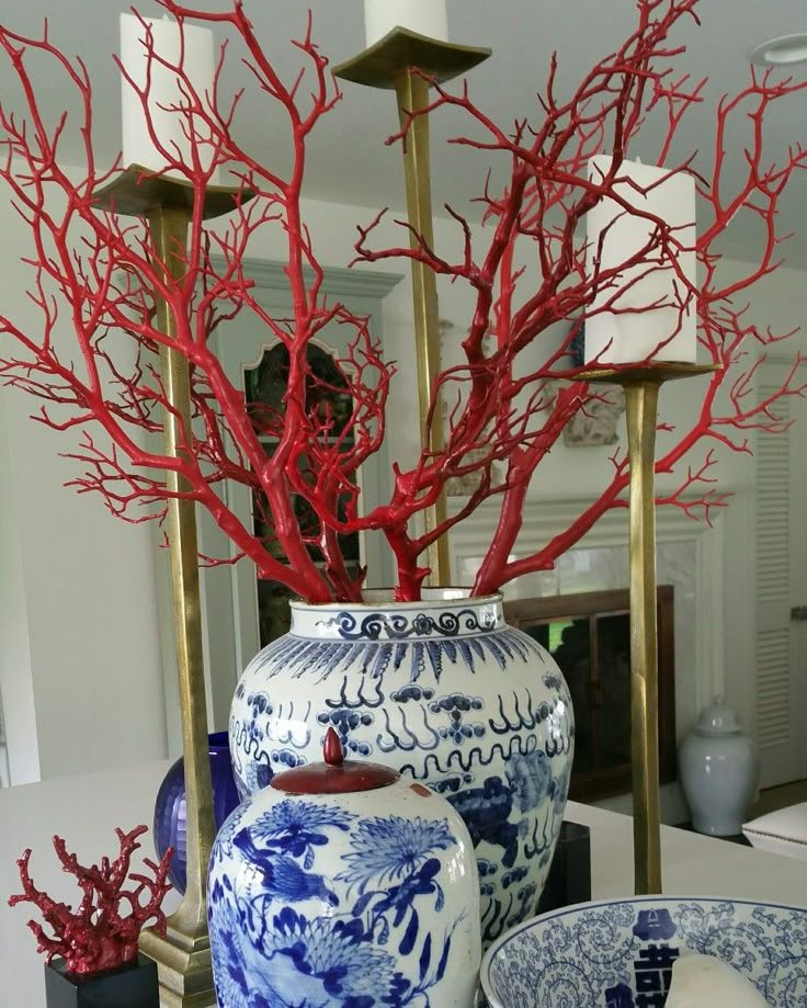
12. Red FLOWERS or BRANCHES
Tips for Using Red Like aN INTERIOR Designer OR STYLIST
Use it sparingly. The key is “pop,” not “take over the room.”
Balance it with neutrals. White, cream, gray, and even soft sage green help red stand out without clashing.
Echo it subtly. If you use red in one item, consider another tiny red object across the room for cohesion (but don’t overdo it).
Let texture help. A red velvet pillow feels different from a red ceramic bowl—texture deepens the impact.
Think seasonally. Red feels cozy in winter, vibrant in spring, and spicy in fall. Don’t be afraid to swap in seasonal pops.
Why It Works (and Always Has)
The “unexpected pop of red” works because it respects the power of red. It doesn’t flood the space—it surprises you. It catches your eye. It creates curiosity. And it reminds us that a room, like a great outfit or a work of art, doesn’t need to be complicated to be compelling.
Sometimes, all you need is one bold move.
So the next time your space feels like it’s missing something? Try a little red. Unexpected, yes—but exactly what your room might be craving.